I've been thinking a lot about global warming over the past week and a half, mostly due to Al Gore's speech. It seems like such an intractable problem, and I think many people feel that it is "not a big deal" because it can be difficult to see the downside of a warmer world--particularly when you live in a wet and frequently chilly place like Seattle. So, over the weekend I thought I would do a little experiment and make some quick and dirty maps of how an increase in sea level brought about by global warming would affect my city, my house, and my workplace.
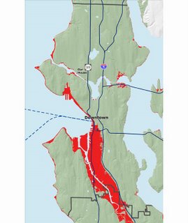
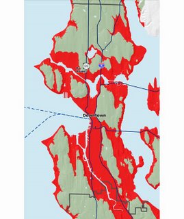
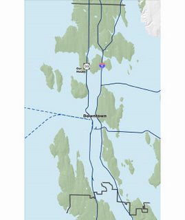
I assumed two different scenarios--first, a relatively conservative 20' (6 m) increase in sea level, and second, a considerably more frightening 200' (60 m) increase. The first three maps show the City of Seattle with the 20' increase, then the 200' increase, then what a "new" Puget Sound would look like.
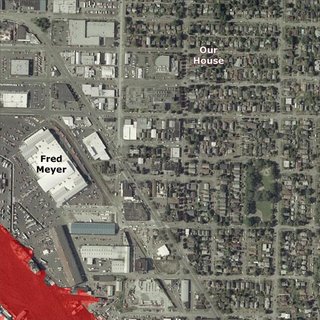
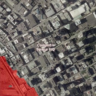
The next four maps show my neighborhood with a 20' and 200' increase (Fred Meyer is labeled as a landmark, not as an endorsement), then the portion of downtown where
CommEn Space is located. In all maps (except the "expanded Puget Sound" map) red indicates the extent of the new sea level. Under the 20' scenario, things aren't so bad near my house--the salt water would flood parts of a few shipyards and a parking lot or two. Under the 200' scenario--which would result from the loss of Greenland's ice sheet and a good chunk of the Antarctic ice sheet--things are very, very bad indeed. Seattle would be reduced to an archipelago, and my house and the first several stories of the building where I work would be under water.
Needless to say, I'm feeling motivated to try even harder to reduce my carbon emissions!
UPDATE: Just read Eric's
recent blog posting where he's done much the same thing, using a Google Maps mash-up (of course!) called
Flood Maps. I am extremely happy this issue is finally gaining so much visibility.
